When I first read the original Age of Average blog post, I thought it was an overreaction.
Alex’s main point is our culture is becoming homogenized.
From film to fashion and architecture to advertising, creative fields have become dominated and defined by convention and cliché. Distinctiveness has died. In every field we look at, we find that everything looks the same.
Everyone is copying each other and adopting the same set of practices and designs. Homogeneity is rewarded and uniqueness and originality are sacrificed.
But… humans have always copied each other. Creators from Rick Rubin to Virgil Abloh to Hemingway not only copied their predecessors but straight up stole from them. Relentless copying and refinement are part of the creative process. So, what’s the difference this time around? Does Alex, just not understand the historical process of art and invention?
This article was different, though.
However, the more I read, the more I questioned our current cultural forms. I realized, “The Age of Average” was the just tip of the iceberg. One article after another uncovered a new piece of evidence. I started to notice elements of The Age of Average popping up in my everyday life.
In the movies I watched, the email newsletters I read, and the classical books I annotated. That’s right, I became (and still am) obsessed with the idea our culture is stuck. That we are in a unique period of time where artists are no longer capable of pushing culture forward. A time in which businesses and ordinary people can no longer imagine a unique future, but instead cling onto past cultural forms as a way to maintain their emotional and mental security. A period where designers and architects are obsessed with pastiche and minimalists desgins. Where it is easier to pull from the past, copy what has already worked, and follow a defined path than rewrite your own version of history.
I want to be clear: I’m not talking about a subjective good or bad. Great art still gets made. Great buildings still get built. Cool company logos still get designed. It’s subjective, sure, but you know greatness when you see it. And even if something is a remake or a play on the past, it can still be great. Many of the “bests” weren’t the first.
For example, most first movers in business weren’t the companies that made it. It’s rare for the first of it’s kind to be a massive success (Myspace -> Facebook, Dig -> Reddit, eToys&Pets.com -> Amazon).
The biggest successes aren’t the most innovative, but the most effective. They are excellent executors, but maybe not excellent innovators. They learn from the mistakes of the first mover, the trailblazer, and reach massive commercial success. We barely remember the innovator and transfer all the credit to the winner. It doesn't mean the winner did more for society and humankind. If anything, the trailblazer was the one who we should actually praise. The one who pushed us forward. Who crossed the boundaries of imagination and made the impossible, possible.
I started to realize, the art and culture I see our often not boundary-pushing or all that imaginative.
In David Roth’s article, Everything is Silicon Valley Now. he talks about how the wealthiest and most powerful people have more power and ownership than ever before. In turn, their personalities and preferences show up in the things they own. And, they own everything. Tech companies, retail conglomerates, media empires, and so much more.
These people → the richest, greediest, and least cool people around us, morph culture.
It is not just a feeling but a fact that this moment is increasingly governed by the fatuity of the richest and most powerful people in the culture, and warped everywhere to reflect and serve their antic relentlessness and idle sadism and zealously anhedonic overall mindset. These powerful people are boring and smug and greedy, but also so uninterested in anything but their dorky feuds and faddish self-flattering worldview that they mostly tend to just reproduce all that. Because these people have bought so much, not just like "politics" and "the news media" but things that people actually enjoy and use all the time, the consequences of that small-mindedness rush downhill daily.
The richest people and companies swallow up everything. Instead of honoring and preserving originality and uniqueness, or letting artists and creators make something new and different, we’re left with boring, inoffensive, and homogenous creations. The only metric that actually matters to these people is the bottom line. So, if we have to make another Marvel movie or listen to a focus group’s interior design preference for the new hotel in Seoul, so be it.
I loved David’s article, but it wasn’t until The Age of Average I knew I needed to write this post. A big reason is how he starts his essay.
It’s a story about two Russian artists who set out to find out what Americans most desire in their art. After hiring a market research team, asking thousands of questions, and doing hundreds of hours of research. They found out what people liked.
THIS:
Actually, it wasn’t just Americans who preferred wide blue landscapes with a few figures in the foreground alongside green shrubbery. The artists repeated the same process in 11 other countries including Mexico, Great Britain, and China. Everyone preferred the same style.
One of the artists, Vitaly Komar said, “Looking for freedom we found slavery.”
In an ironic ode, the project was called “People’s Choice.”
Production shouldn’t be decided by the masses. We shouldn’t depend on focus groups for all of our art and design preferences.
Becasue once a large consensus of people agrees on something, it loses what made it weird, unique, and fun. When we aim for consensus, we’re left with something that doesn’t feel quite human.
Focus groups, analytics, and a premium on profits over personal taste often leave us feeling empty. Feeling off.
And we definitely shouldn’t depend on a small group of billionaires who have the same creative imagination as my 67-year-old uncle who wears New Balances and Khaki’s and eats at Norms every morning reading the National Review.
The People’s Choice isn’t just happening in contemporary art. It’s also happening right in front of our eyes. No like, literally, it’s happening right in front of me, right here, at this hotel I’m writing at in Brooklyn.
Airspace
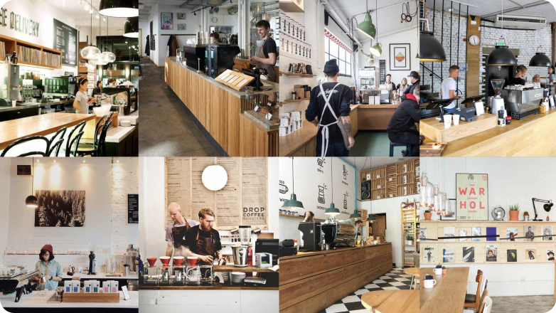
In an article with the Guardian, journalist Kyle Chayka, describes how interior design is converging on the same look, “The coffee roaster Four Barrel in San Francisco looks like the Australian Toby’s Estate in Brooklyn looks like The Coffee Collective in Copenhagen looks like Bear Pond Espresso in Tokyo.” [Like the Ace Hotel in Brooklyn where I’m writing this essay].
Kyle calls it Airspace and its features include ough-hewn wooden tables, hanging Edison bulls, brown end tables, empty space, dimensional proportions, and transparent glass. People also call it the Brooklyn Look or the Hippy Aesthetic, among other stupid names.
One of the main perpetrators of Airspace is Airbnb rentals (part of the inspiration for the name). Go on your computer and sort through bookings in Seoul, Charleston, or San Francisco and you’ll find the same minimalist, simple, clean, inoffensive interior design.
In an effort to please every Airbnb guest, we’ve landed on an unimaginative, characterless, and worst of all global design. It’s not just boring and unoriginal, but concerning. It’s a fundamentally commercial aesthetic that evolved to meet everyone’s needs. It’s the, “People’s Choice” of interior design.
The simplicity of design encourages an impression all errors have disappeared. Everything is in order. When you step into this coffee shop, you’re stepping into a place with rules. It creates an impression of homogeneity across all dimensions of life and its supposed to comfort us.
Apartments and Real Estate
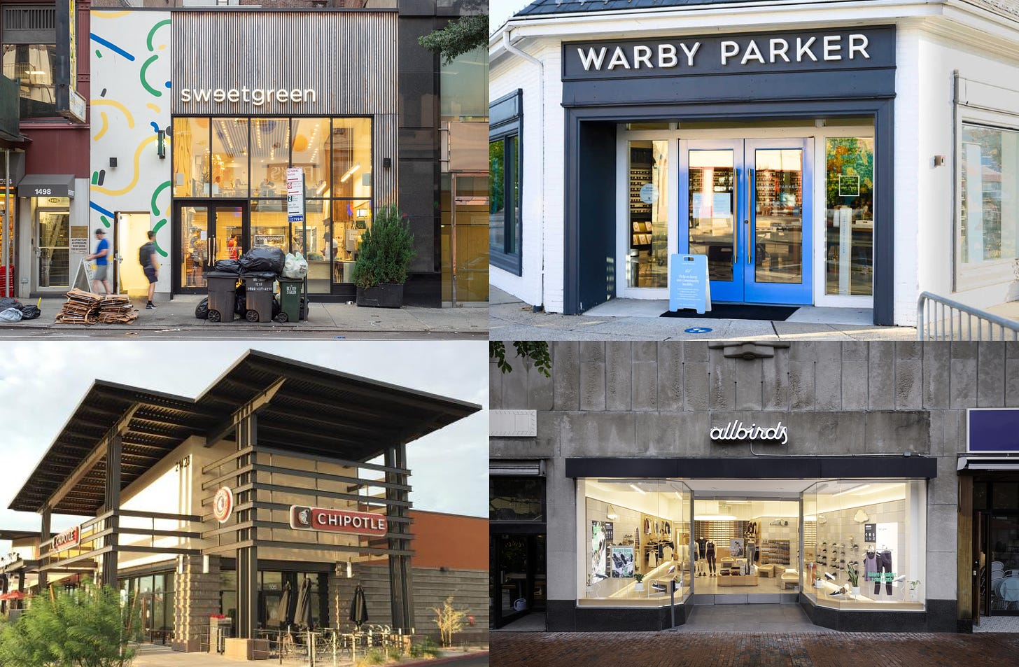
On my walk home from Ace Hotel, I pass by an area of Brooklyn that, for most of its history, was safe from the Sweetgreens, Chipotles, Warby Parkers, and Allbirds that mark gentrification.
Things have changed and the area is not so safe anymore. Especially 4th Ave, one of the busiest stretches of Park Slope.
It wasn’t until I read Alex’s blog post and Coby Lefkowitz’s “Why Everywhere Looks the Same,” I realized how similar the new apartments on 4th Ave. look. Actually, how similar they look to every new apartment, including my friend’s apartment in Denver I stayed at a few weeks ago.
(It’s funny how the day after I came back from Denver I read “The Age of Average” for the first time.)
Denver is ground zero for bad architecture. My uneducated guess, is the newer the city, the uglier the designs. At least New York sprinkles in brick buildings and stone structures among the new Blackstone and Blackrock developments. Most of Denver’s buildings were built in the last few decades.
Michael Paglia, a writer for Westword in Denver, penned a popular piece about Denver’s characterless design called, “Denver is Drowning in Awful Architecture.”
Paglia said, “I don’t think these buildings will be around in 40 years. They’ll collapse and be maintenance problems. We’ll remember the small sliver of good architecture being built today.”
(Maybe the same will happen to our culture, too… More on that later)
This isn’t a new phenomenon. In 1995, the Professor of Architecture and Urban Design at Harvard University, Rem Koolhaas, published an essay titled The Generic City:
Is the contemporary city like the contemporary airport— ‘all the same’? Is it possible to theorise this convergence? And if so, to what ultimate configuration is it aspiring? Convergence is possible only at the price of shedding identity. That is usually seen as a loss. But at the scale at which it occurs it must mean something. What are the disadvantages of identity, and conversely, what are the advantages of blankness? What if this seemingly accidental, and usually regretted, homogenization was an intentional process, a conscious movement away from difference toward similarity.
Koolhaas suggests building homogenization and the shredding of identity is intentional. But what are we running from? And more importantly, where are we going to? Why would we leave originality and uniqueness for unoriginality and sameness?
In his essay, Coby provides four reasons why everything is being built the same:
Building codes: Unlike in the early 20th century, developers are increasingly constrained by building codes.
Rising land costs cause developers to pack as many properties as possible into every site.
Rising barriers to entry have caused the industry to consolidate.
Scale: Developers reduce their costs by reusing the same plans across multiple sites
Building codes diminish the possibilities of more unique structures. The rising land costs and barriers to entry diminish the number of new developers. The developers left standing are oftentimes conglomerates with multiple construction sites that are focused on one thing: profit. They are incentivized to build a lot not too build well. The more scale, generally the more profit.
Development and land costs are only affordable to the uber-rich, which creates a vicious cycle. “Land costs rise, which pushes out smaller developers, which leads to larger developers taking more market share, who in turn bid up land prices, which pushes out relatively smaller developers, and so on and so forth.”
Mid-rise apartments stink up all our cities, now. You see em’ everywhere. You don’t notice them because they aren’t ugly, they aren’t pretty, and they sure aren’t landmarks. They are just bleh.
Alex says the name for this style of architecture goes by Fast-Casual Architecture and McUrbanism.
It’s a main focus of David Perrell’s, The Microwave Economy. David was the first tenant to move into a new Brooklyn apartment. He said, it was an accomplishment he would later regret. Within a few months, his bathroom ceiling was coated with mold in the winter, the shower’s faucet angles were off, and the “tiles on my bathroom floor were cut so lazily that I could see the coarse-grained plaster underneath.”
Who’s building these soulless, cheap abodes?
Coby says, “From 2016 to 2020, the 25 largest developers will have produced a quarter of the supply of apartment buildings nationally. These 25 developers are projected to deliver nearly 30% of the entire multifamily housing supply in America in 2020. The market is a near oligopoly.” Remember that word.
The larger developers don’t care what their buildings look like. They don’t have to live in them, walk by them on a daily basis, or see them as they pick up their kid from the neighborhood public school. They just slap a generic name on the building (The Point, The Park, or The Village are popular) and wait for tenants to flock like mosquitoes to fluorescent light.
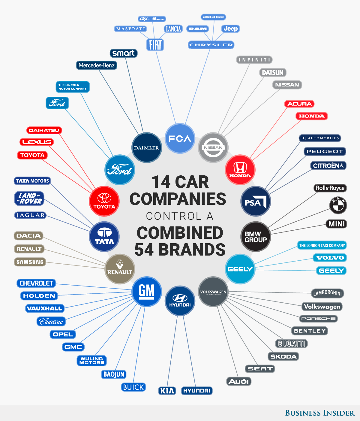
Just as the Real Estate Industry is an oligopoly, so is the automotive industry. 14 companies own the 62 largest automotive brands in the world. In the United States, 3 car manufacturers own most of the market - Ford, General Motors, and Stellantis (formerly Chrysler).
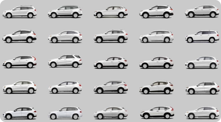
Which is why it’s not a shock all cars are adopting the same shapes.
In 2015, Jim Carroll, the ex-Chairman of BBH London recalled, “Some of you will recall the day in 1983 when we woke up and noticed that the cars all looked the same. There was a simple explanation. They’d all been through the same wind tunnel. We nodded assent at the evident improvement in fuel efficiency, but we could not escape a weary sigh of disappointment. Modern life is rubbish.”
In an effort to improve fuel efficiency, we’ve decided on the optimal dimensions, shapes, and proportions of a car and sucked the character out of our beloved death contraptions.
In Drew Magary’s Why Does Every New Car Look Like Every Other New Car?, he noticed how similar all the new cars looked on the lot.
It was a Hyundai Santa Fe, which kinda resembles the Acura RDX, which kinda resembles the Volvo XC60, which kinda resembles the BMW X3. You might call that a generous leap from one car to the next, but these four models are all 75 inches wide, 66 inches high (save for the Volvo, which is 65), and they only differ in length by a maximum of three inches.
Sounds similar, ey?
It wasn’t always this way, though.
Legendary car designer, Ian Callum, says, “There was a time when you could identify the country the car came from.”
That’s not the case anymore. Cars are designed to be nationless and classless. For the broadest possible audience at the highest possible revenue in the cheapest possible way.
We laughed at cars that were different, we didn’t want sports cars anymore, and we’ve now all agreed that big grilles are in, so this is what we’re left with.
It’s not just that they’re all shaped the same.
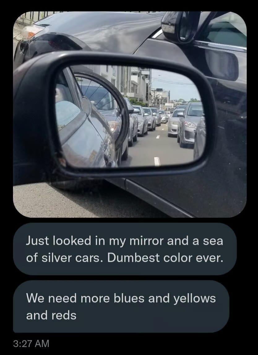
According to data shared by Jökull Solberg, around 40% of cars sold in 1996 were monochromatic (black, white, silver or grey). 20 years later the figure increased to almost 80%.
You can blame the car manufacturers for producing homogenous vehicles or you could blame us, the consumer, for buying them.
The manufacturers need to look good on their earnings calls and we, well, we don’t really have time or money to wage wars over car aesthetics. Producers produce and consumers consume. Each of us is influenced by the other in an endless cycle of consumption.
Business
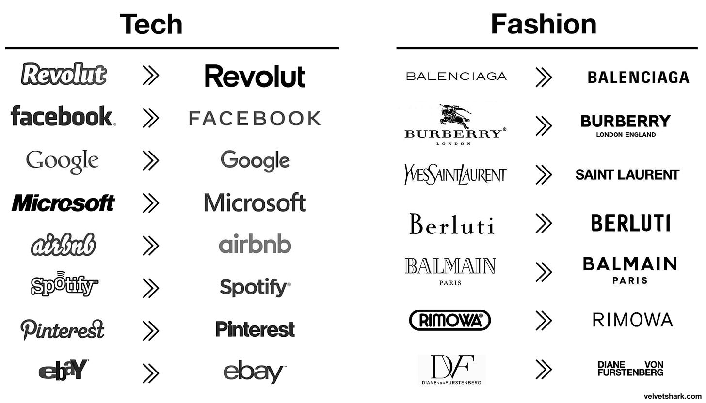
Speaking of earnings calls, do you guys remember this graphic?
Every brand logo is a big, bold sans serif font. Cutesy, friendly, utopian, and honestly frightening.
Airbnb hosts arrange their rentals for a global appeal, real estate developers build their buildings for everyone to live in, car manufacturers make their cars for everyone, and brands are designing their logos the same way.
It’s not just their logos, but UI design and websites, too.
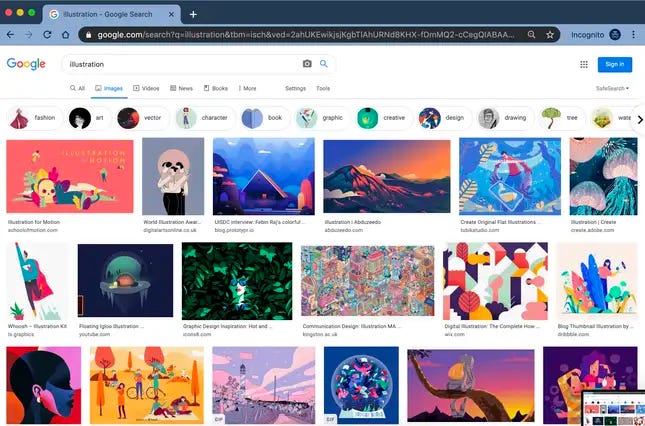
The style is called Corporate Memphis and it’s infiltrated our dating apps, enterprise software, and billboards.
In Josh Gabert Doyon’s article, Why does every advert look the same? Blame Corporate Memphis, he writes, “The style is, after all, simply a reflection of big tech, and how it has constructed a world with users on one side and executives on the other. The illustrations done in Corporate Memphis style are rarely, if ever, credited to the artist who produced them.”
Corporate Memphis is easier and cheaper to create than stock imagery. The style also lets non-illustrators use image banks like FreePik, UnDraw, and Adobe’s own vector art library to co-opt the style for themselves.
Like fast food, Corporate Memphis doesn’t take long to create and it’s hard to deviate from a clean, simple design. Its slogan should be: Boring and bland but global.
Anne Quito, wrote an article in GQ, called, Why editorial illustrations look so similar these days.
Anne’s argument centered around two main theories: technology and money.
Most editorial illustrators today prefer working on the computer for the sake of efficiency. This produces ubiquity because designers are forced to use the same templates, straight lines, shapes, and colorways.
The other, more convincing reason we’re seeing dull, homogenous designs is that it's hard for designers to make money unless they conform to company’s requests. Instead of focusing on one project and spending more time and effort on it, illustrators optimize for efficiency so they can fulfill more assignments and earn a living wage.
According to the US Bureau of Labor Statistics:
A US-based editorial illustrator earns an average of $47,000 a year
The mean annual wage for graphic designers in the U.S. in 2018 is $54,680
2018 annual average wage for a graphic designer in New York was $64,840 (the highest of any state)
In a 2018 global survey of 1,400 illustrators, Ben O’Brien found that 70% of illustrators believe that they can’t survive on drawing alone.
In the 1970s, New York magazine paid illustrators $100 for spot illustrations, which was considered a “miserly amount” even back then. When adjusted for inflation $100 in 1970 is $650, which is still more than the $250 to $500 illustrators can expect today.
Time’s former art director Walter Bernard recalls paying $2,000 (the equivalent of $9,961 today) during his tenure as art director in the late 70s.
Time paid $3,000 for a cover illustration in 2014. Four decades later and a whopping 50% pay bump.
The pressure to produce more work quicker spoils experimentation. We’re more concerned with brevity and popularity than quality and creativity.
I guess, we’ve figured out how to refine our interior design, buildings, cars, and business design. Just as companies and executives feel the pressure to refine their apps to appeal to the most people, women feel the need to optimize their patriarchal profit centers - their bodies.
People
The strangest and most disturbing trend I discovered during my research is our obsession with optimizing beauty. I grew up in the San Fernando Valley, the porn capital of the world. It was normal for high school classmates to get lip filler and as they got older botox and boob jobs.
Jia Tolentino’s article, The Age of Instagram Face: How social media, FaceTune, and plastic surgery created a single, cyborgian look, is a deep dive into the trend of Instagram face and plastic surgery.
Even if you haven’t heard of Instagram face before, we all know what it looks like.
It’s a young face, of course, with poreless skin and plump, high cheekbones. It has catlike eyes and long, cartoonish lashes; it has a small, neat nose and full, lush lips. It looks at you coyly but blankly, as if its owner has taken half a Klonopin and is considering asking you for a private-jet ride to Coachella.
[I still have nightmares about the coy but blank Klonopin look from my time club promoting in LA]
There is a strong pressure on women to reach unrealistic beauty standards. Our culture rewards women for youth and beauty above other important things like intellect and personality. We shouldn’t be shocked, that in 2018 Americans spent $16.5 billion on cosmetic surgery - 92% of them we’re females.
Before I bought a New Yorker subscription to read Jia’s article I googled [the name of the article + Reddit], so I could see what people were saying about the article.
The top comment summarizes many women’s feelings in today’s world, “Living in LA for the past 4 years, after a lifetime of truly feeling confident and self-assured (due in part to years of playing sports and a mother who never made comments about my body whatsoever), I finally succumbed to Botox.”
Another reddit user calls the IG movement, “Empowering economically and debilitating culturally.” We empower women to get botox and claim full autonomy over their bodies, but also concede their worth is tied to their bodies. Without botox and other enhancements they aren’t valuable.
Even though the movement is wrapped in "feminist" actions, it is patriarchal and capitalist at its core. The feminism I understand advocates for female freedom and an escape from traditional patriarchal standards. An escape from tying value to beauty. So, while Instagram face is a choice, it’s a choice many women feel coerced into. And it reinforces the same patriarchal standards they are trying to avoid.
I think we should get straight: Instagram face isn’t ugly. We’re naturally attracted to high cheek bones, strong jawlines, and a narrow nose. There’s a reason women with botox and beauty modifications get more likes on social media and receive more attention. The market has spoken and it demands the cyborgian look. We shouldn’t be shocked when women try to fit into society.
In Jia’s article, make-up artist, Colby Smith, said, "People are absolutely getting prettier.” The Airspace interiors, shiny new apartments, clean logo designs, Corporate Memphis UI, blue landscapes, and sleak cars aren’t ugly. But, there is something about them that isn’t quite right.
Instagram face is weirdly terrifying and dystopian. And after everyone copies everyone and no one can create an original, unique aesthetic, it becomes boring and ugly.
Smith later conceded, “It’s obviously terrifying.”
Pop Culture
You know what else is terrifying?
In 2021, only one of the ten top-grossing films (the Ryan Reynolds vehicle Free Guy) was an original. There were only two originals in 2020’s top 10, and none at all in 2019.
It’s normal for artists to copy and all great art is a derivative of other art (you know the saying attributed to Picasso, about good artists borrowing and great artists stealing). Including this post which is a derivative of the many articles I mention. Relentless copying is part of creating new things. The creative process includes copying, innovating, changing, adding, and doing it over and over again until you create something you love. Sort of how this post is a combination of different posts.
In Kevin Leland’s article, What Made Us Unique, he says, “Perpetual, relentless copying and innovation—that is the secret of our species’ success.”
However, current pop culture has reached a level of unoriginality we haven’t seen before.
The Ryan Reynolds stat is from Adam Mastroianni’s article, Pop Culture Has Become an Oligopoly. The article explored how so many of the TV shows, books, and video games we consume are just remakes of originals.
The industry is a beacon of safe bets fed to us through shady algorithms. Everyone in pop culture can do math and they’ve gotten really good at it. From film to music to publishing, it’s the same 5 companies who control everything.
In Ben H. Bagdikian’s book, the New Media Monopoly he says, “Since 1983...the number of corporations controlling most of America’s daily newspapers, magazines, radio and television stations, book publishers, and movie companies has dwindled from fifty to ten to five.”
FILM
The top 4 film studios - Disney, Sony, Universal, and Warner Bros. account for more than 80% of the market.
Adam says, “Until the year 2000, about 25% of top-grossing movies were prequels, sequels, spinoffs, remakes, reboots, or cinematic universe expansions. Since 2010, it’s been over 50% every year. In recent years, it’s been close to 100%.”
Even a third of the top 30 most-viewed shows are spinoffs of other shows in the top 30 (e.g., CSI and CSI: Miami) or multiple broadcasts of the same show.
I’m not a big movie or TV person, so I can’t say whether the movies today are better or worse than the movies 10, 20, 30, 40 years ago. I do know, prequels, sequels, spinoffs, remakes, reboots, or cinematic universe expansions are lazy. You don’t need to be a genius to write a script for Spiderman 6.
If Spiderman 5 did $200m at the box office, has 25m social media followers, stars Zendaya and Tom Holland, and spends $20m on advertising, the movie will make $250m. It’s simple math. It works because everyone gets paid. The theatres, actors, directors, producers, and most importantly, the big studios report earnings growth.
MUSIC
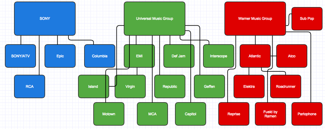
According to the Oxford Society for Commercial Law, the big three recording labels:
Universal Music Group,
Sony Music Entertainment
Warner Music Group
Own 70% of the music recording market share and 58% of the music publishing industry.
Before 1991, record labels manipulated the top charts to prop up their top artists. This meant rock and roll dominated the charts. But, in 1991, Billboard switched its methodology to be more objective. As a result, Rock and Roll plummeted and Rap and Country surged. Since this change, popular songs stick around longer than before. One analysis found rap and hip-hop have dominated American pop music longer than any other musical genre in history.
It’s not just the same genre’s dominating, but the same artists. Azhad Syed, a data scientist, ran an analysis that found the number of artists on the Billboard Hot 100 has been decreasing for decades.
Because of the way we listen to music, it becomes a self-fulfilling prophecy. A song gets popular, more people listen to it, Spotify playlists blast ‘em, it goes mainstream, and we rewind the process.
Even though I’m not a music expert most of the music I listen sounds the same. Many of the songs are sampled with or straight rip off of songs from previous generations. Less and less experiments and more and more sure bets.
BOOKS
The same thing is happening in books, too. Mastroianni says, “It used to be pretty rare for one author to have multiple books in the top 10 in the same year. Since 1990, it’s happened almost every year.”
Part of the reason might be the oligopoly of book publishers who decide why, what, and when things get published. There are only five major English-language book publishers on the planet.
Penguin Random House.
Hachette Book Group or Lagardère Group. Formed when Hachette Livre purchased the Time Warner Book Group (Warner is everywhere)
Harper Collins. Owned by Rupert Murdoch's media conglomerate News Corp (which also owns Fox News)
Simon and Schuster. Parent orgs are CBS and Paramount
Macmillan.
Writers are powerless compared to publishers and they don’t really have anywhere else to go. Self-publishing is almost impossible in today’s environment becasue of high production costs and publisher’s connections to critics and distributors.
In his article, The Structure of Publishing, N.E.O Bernhardsson writes, “Even if a small publisher publishes better quality books, which is often the case, they won’t be able to get it out to as many readers because they lack marketing muscle and name recognition. Publishing therefore becomes a natural oligopoly where the already large become even larger.”
The same way the film studios select famous actors and popular series, the same way developers, illustrators, and businesses play by the same formulaic, safety first rules, so do book publishers. They minimize risk until there is none, even though most classics were immense risks. The people who get ripped off the most are us, the readers, who have to pay higher prices and read worse books.
In his blog post, And Then There Were Four: Book Publishing and Oligopoly, Daniel Stride says, “Cultural discourse itself becomes more narrow, since these books are the literature that reflects, entertains, stimulates, and inspires the twenty-first century West.”
Some of the best books ever written were done so in obscurity. Off the beaten path of normal society. Now, production is cut off to the people who can afford to produce AND distribute. Distribution is the most important part of the post-industrial cyberspace economy. A record label rather side with an average Steve Lacy song that goes viral on TikTok than an original indie artist making incredible music. Even if they KNOW the indie artist is objectively better. It’s simple math, bozos.
In 2012, Kurt Anderson wrote, “But these days, even as technological and scientific leaps have continued to revolutionize life, popular style has been stuck on repeat, consuming the past instead of creating the new. Lady Gaga has replaced Madonna, Adele has replaced Mariah Carey— both distinctions without a real difference—and Jay-Z and Wilco are still Jay-Z and Wilco.”
Previous generation’s pop culture and art evolved in 20-30 year intervals. But, our culture is still stuck in 1992.
Maybe none of this matters. Maybe it’s part of the natural artistic and creative life cycle. Maybe you don’t even see the need for pop culture. Pop culture is entertainment and if people enjoy Marvel remakes and Danielle Steele novels why does it matter? I guess it depends on what you think of the value of pop culture.
I believe pop culture plays an essential role in society. As Erik Hoel says in his blog post, How the MFA swallowed literature, “Movies, TV, music, books, and video games should expand our consciousness, jumpstart our imaginations, and introduce us to new worlds and stories and feelings. They should alienate us sometimes, or make us mad, or make us think.”
Pop culture is supposed to capture the current zeitgeist of society. Help us escape the doldrums of life and imagine new worlds. It moved us to think, dream, cry, and be empathetic.
I think there is a real case for pop culture, art, design, and business to be unique and original and reflect the weird, oftentimes odd parts of who we are. It’s okay for something to flop. It’s okay for a bad idea to breathe into the world. It’s also okay for our tastes to change. Some of the stuff we love wasn’t popular at first. There are a lot of examples of tastes adapting. Sometimes we’re weirded out and then change our minds and grow to like things. Isn’t that how evolution works?
Production needs our consumption. If no one bought the cars or listened to the music, we wouldn’t be in this situation, but we do. In Everything is Silicon Valley Now, David Roth says, “The masses groan and struggle but mostly just deal with it.”
Because what else are we going to do? Stop buying anything? Spend all day in the streets protesting Airbnb, Paramount, Warner, and Penguin?
Nothing is safe from Cultural Moneyballism. Our architecture, cars, movies, books, art, TV, businesses, designs, and sports are all optimized and profit-centered to reflect the values of the billionaires who bought and conquered these profit centers.
The stuff that gives us joy is being monopolized by soul-sucking institutions and ideas. Our mind, body, leisure time, homes, cars, clothes, and culture is swallowed up by public earnings calls, private equity hurdle rates, and unrealistic calls for growth. Just as fast food was created to accommodate large numbers of busy commuters, travelers, and wage workers, our current culture was created to satisfy a tired, overstimulated, and ADHD person.
I think explained what’s happening to our culture and started to explore the material reasons why it’s happening.
Next week I am going to go beyond the material reasons and dive deeper into the societal, philosophical, and psychological reasons we’re seeing the pervasiveness of Cultural Moneyballism and Fast Foodification of America and Why we can’t create new things.
Subscribe to follow along ...


